Interactive Jupyter Notebooks for the visual analysis of critical choices in Global Sensitivity Analysis
This document provides:
- a brief introduction to Global Sensitivity Analysis (GSA);
- a workflow to asssess one of the critical choices needed to set up a GSA application. Here we use the SAFE (Sensitivity Analysis For Everybody) toolbox (References 1-2).
The critical choice that will be considered is:
The impact on the GSA results of the definition of the space of variability of the input factors.
In this example we apply the Regional Sensitivity Analysis GSA method to the rainfall-runoff Hymod model.
PART I: Introduction
What is Global Sensitivity Analysis and why shall we use it?
Global Sensitivity Analysis is a set of mathematical techniques which investigate how the uncertainty in the model inputs influences the variability of the model outputs (References 3-4).
The benefits of applying GSA are:
Better understanding of the model: Evaluate the model behaviour beyond default set-up
“Sanity check” of the model: Test whether the model "behaves well" (model validation)
Priorities for uncertainty reduction: Identify the important inputs on which to focus computationally-intensive calibration, acquisition of new data, etc.
More transparent and robust decisions: Understand how assumptions about uncertain inputs reflect on the modelling outcome and thus on model-informed decisions
How Global Sensitivity Analysis works
GSA investigates how the uncertainty in the model input factors influences the variability of the model output.
An 'input factor' is any element that can be changed before running the model. In general, input factors could be the model's parameters, forcing input data, but also the very equations implemented in the model or other set-up choices (for instance, the spatial resolution) needed for the model execution on a computer.
An 'output' is any variable that is obtained after the model execution.
The main steps to perform GSA are summarised in the figure below.
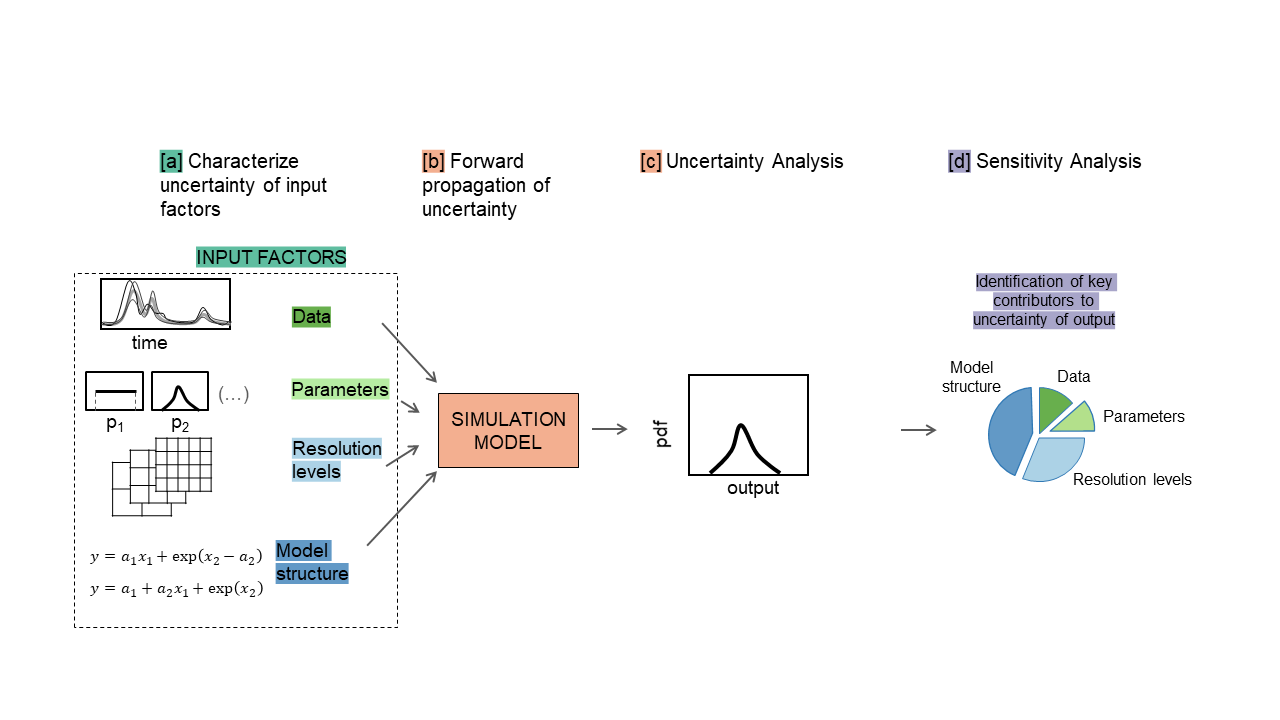 a. The input factors are sampled from their ranges of variability.
b. The model is repeatedly run against each of the input sampled combinations.
c. The output samples so obtained can be used to characterise the output uncertainty, for instance through a probability distribution or scatter plots.
d. GSA is applied to the input and output samples in order to obtain a set of sensitivity indices. The sensitivity indices measure the relative influence of each input factor on the uncertainty of the output (References 4,5).
from __future__ import division, absolute_import, print_function

import numpy as np
import pandas as pd
import matplotlib as mpl
import matplotlib.pyplot as plt
import scipy.stats as st
import pandas as pd
import plotly.express as px
from plotly.subplots import make_subplots
import plotly.graph_objects as go
from ipywidgets import widgets

# Import SAFE modules:
import os
mydir = "C:/Users/valen/OneDrive - University of Bristol/proj_SAFEVAL/SAFEPy/SAFEpython_v0.0.0"
os.chdir(mydir + "/SAFEpython")

import SAFEpython.RSA_groups as Rg # module to perform RSA with groups
import SAFEpython.plot_functions as pf # module to visualize the results
from SAFEpython.model_execution import model_execution # module to execute the model
from SAFEpython.sampling import AAT_sampling, AAT_sampling_extend # module to perform the input sampling
from SAFEpython.util import aggregate_boot  # function to aggregate the bootstrap results
from SAFEpython import HyMod
Test model: Rainfall-runoff Hymod model
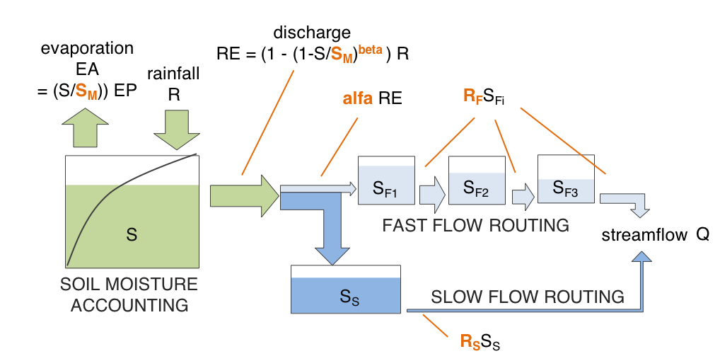
Before applying GSA, let's have a brief overview of the HyMod model, which it is a parsimonious rainfall-runoff model based on the theory of runoff yeild under infiltration excess.
Hymod (Boyle 2001; Wagener et al. 2001) is composed of a soil moisture accounting routine, and a flow routing routine, which in its turn is composed of a fast and a slow routing pathway.
The model structure is illustrated in the figure below.
Step 2: Setup the model
Define:
- the input factors whose influence is to be analysed with GSA,
- their range of variability (choice made by expert judgement, available data or previous studies),
- choice of their distributions.
Define input factors of interest:
M = 5 # number of input factors
col_names = ["$S_M$" , "$beta$" , "$alpha$", "$R_S$", "$R_F$"] # input factors of interest
Define their range of variability:
data = [["mm"  , 1   , 400 , "Maximum storage capacity"],
        ["-"   , 0   , 2   , "Degree of spatial variability of the $S_M$"],
        ["-"   , 0, 1, "Factor distributing slow and quick flows"],
        ["1/dd", 0, 0.1, "Fractional discharge of the slow release reservoir"],
        ["1/dd", 0.1, 1, "Fractional discharge of the quick release reservoirs"]]
model_inputs = pd.DataFrame(data,
                           columns=["Unit", "Min value", "Max value", "Description"],
                           index = ["$S_M$" , "$beta$" , "$alpha$", "$R_S$", "$R_F$"])
model_inputs
Define choice of their distributions:
distr_fun = st.uniform # uniform distribution
distr_par = [np.nan] * M
samp_strat = 'lhs' # Latin Hypercube
fun_test = HyMod.hymod_MulObj
N = 2000 # number of samples
# Load data:
data = np.genfromtxt(mydir +'/data/LeafCatch.txt', comments='%')
rain = data[0:365, 0] # 1-year simulation
evap = data[0:365, 1]
flow = data[0:365, 2]
warmup = 30 # Model warmup period (days)
class setup_model:
    def __init__(self, x1, x2, x3, x4, x5):
        # The shape parameters of the uniform distribution are the lower limit and the difference between lower and upper limits:
        self.xmin = [x1.value[0], x2.value[0], x3.value[0], x4.value[0], x5.value[0]]
        self.xmax = [x1.value[1], x2.value[1], x3.value[1], x4.value[1], x5.value[1]]
        for i in range(M):
            distr_par[i] = [self.xmin[i], self.xmax[i] - self.xmin[i]]
        self.distr_par = distr_par
Step 3: Sample inputs space
The number of model runs (N) typically increases proportionally to the number of input factors ($M$) and will depend on the GSA methods chosen as well.
class sample_input:
    def __init__(self,distr_par):
        self.X = AAT_sampling(samp_strat, M, distr_fun, distr_par, N)
Step 4: Run the model
For each sampled input factors combination, we run the model and save the associated model output.
class run_model:
    def __init__(self,X):
        self.Y = model_execution(fun_test, X, rain, evap, flow, warmup)
Step 5: Apply Sensitivity Analysis (RSA) method
This implementation of the RSA method for Sensitivity Analysis requires to sort the output samples and then to split them into a certain number of groups (defined by the user). Afterwards, RSA identifies the sub-samples in the inputs space that produced the outputs in each group and compute the cumulative distribution function (CDF) of each sub-sample. Finally, the sensitivity indices are defined as the (median of the) maximum vertical distance between the CDFs of the various groups.
Here we divide the output samples into 10 groups, where each group contains the same number of samples.
class RSA_method:
    def __init__(self,X,Y,Nboot):
        mvd_median, mvd_mean, mvd_max, spread_median, spread_mean, spread_max, self.idx, self.Yk = \
        Rg.RSA_indices_groups(X, Y, ngroup=10, Nboot=Nboot.value)

        self.mvd_p = pd.DataFrame(mvd_median,columns=model_inputs.index)
        Xdf = pd.DataFrame(X,columns=[col_names])
        xx = pd.melt(Xdf)
        Ydf = pd.DataFrame(Y,columns=["y"])
        yy = pd.concat([Ydf]*M,ignore_index=True)
        self.new_data = pd.concat([xx,yy],axis=1)
        self.new_data.columns = ["Input","x","y"]
        all_ind = np.concatenate((self.idx,self.idx,self.idx,self.idx,self.idx),axis=0)
        all_ind = pd.DataFrame(all_ind,columns=['idx'])
        self.new_data['idx'] = all_ind
Step 6: Check model behaviour by visualising input/output samples
Scatterplots are plotted to visualise the behaviour of the output over each input factor in turn.
Definition of interactivity
def update_figures(change):
    with fig.batch_update():
        distr_par = setup_model(x1, x2, x3, x4, x5).distr_par
        X = sample_input(distr_par).X
        Y = run_model(X).Y[:,0]
        RSA = RSA_method(X,Y,Nboot)
        new_data = RSA.new_data
        fig.data[0].x = new_data.loc[new_data['Input'] == model_inputs.index[0], 'x']
        fig.data[1].x = new_data.loc[new_data['Input'] == model_inputs.index[1], 'x']
        fig.data[2].x = new_data.loc[new_data['Input'] == model_inputs.index[2], 'x']
        fig.data[3].x = new_data.loc[new_data['Input'] == model_inputs.index[3], 'x']
        fig.data[4].x = new_data.loc[new_data['Input'] == model_inputs.index[4], 'x']
        fig.data[0].marker.color = new_data.loc[new_data['Input'] == model_inputs.index[0], 'idx']
        fig.data[1].marker.color = new_data.loc[new_data['Input'] == model_inputs.index[1], 'idx']
        fig.data[2].marker.color = new_data.loc[new_data['Input'] == model_inputs.index[2], 'idx']
        fig.data[3].marker.color = new_data.loc[new_data['Input'] == model_inputs.index[3], 'idx']
        fig.data[4].marker.color = new_data.loc[new_data['Input'] == model_inputs.index[4], 'idx']
        fig.data[0].y = new_data.loc[new_data['Input'] == model_inputs.index[0], 'y']
        fig.data[1].y = new_data.loc[new_data['Input'] == model_inputs.index[1], 'y']
        fig.data[2].y = new_data.loc[new_data['Input'] == model_inputs.index[2], 'y']
        fig.data[3].y = new_data.loc[new_data['Input'] == model_inputs.index[3], 'y']
        fig.data[4].y = new_data.loc[new_data['Input'] == model_inputs.index[4], 'y']
        fig.layout.barmode = 'overlay'

        mvd_p = RSA.mvd_p
        for i in range(0,5):
            fig1.data[i].y = np.array(mvd_p[model_inputs.index[i]])
Definition of the sliders
x1 = widgets.FloatRangeSlider(value = [0, 400], min = 0, max = 800, step = 1, description = model_inputs.index[0],
                              readout_format = '.1f', continuous_update=False)
x1.observe(update_figures,names = 'value')

x2 = widgets.FloatRangeSlider(value = [0, 2], min = 0, max = 4, step = 0.1, description = model_inputs.index[1],
                              readout_format = '.1f', continuous_update=False)
x2.observe(update_figures,names = 'value')

x3 = widgets.FloatRangeSlider(value = [0, 1], min = 0, max = 1, step = 0.1, description = model_inputs.index[2],
                              readout_format = '.1f', continuous_update=False)
x3.observe(update_figures,names = 'value')

x4 = widgets.FloatRangeSlider(value = [0, 0.1], min = 0, max = 0.4, step = 0.01, description = model_inputs.index[3],
                              readout_format = '.1f', continuous_update=False)
x4.observe(update_figures,names = 'value')

x5 = widgets.FloatRangeSlider(value = [0.1, 1], min = 0.1, max = 1, step = 0.1, description = model_inputs.index[4],
                              readout_format = '.1f', continuous_update=False)
x5.observe(update_figures,names = 'value')

Nboot = widgets.IntSlider(value = 2, min = 2, max = 200, step = 1, description = "Nboot",
                              continuous_update=False)
Nboot.observe(update_figures,names = 'value')
Definition of the figure
distr_par = setup_model(x1, x2, x3, x4, x5).distr_par
X = sample_input(distr_par).X
Y = run_model(X).Y[:,0]
RSA = RSA_method(X,Y,Nboot)
new_data = RSA.new_data
p = px.scatter(new_data, x = "x", y = 'y', facet_col = "Input",color="idx",
               color_continuous_scale = px.colors.diverging.RdYlBu[::-1],
               width=1000, height=500)
fig = go.FigureWidget(data=p, layout=go.Layout(barmode='overlay'))
fig.update_xaxes(title_text = "")
fig.update_xaxes(matches=None)
fig.layout.yaxis.title="RMSE of streamflow prediction"
fig.show()
Scatter plots of the output samples (RMSE of streamflow predictions) against the five input factors (the 5 model parameters: maximum storage capacity ($S_M$), degree of spatial variability of the $S_M$ ($beta$), factor distributing slow and quick flows ($alfa$), fractional discharge of the slow release reservoirs ($R_S$) and fractional discharge of the quick release reservoirs ($R_F$)).
Roughly uniformly scattered points (e.g. $S_M$) indicate low sensitivity, while clear patterns when moving along the horizontal axis (e.g. $alfa$) denote higher sensitivity.
Step 7: Plot sensitivity indices (with interactive features)
Definition of the figure
%%capture
mvd_p = RSA.mvd_p
fig1 = go.FigureWidget(layout = dict(width=600, height=400))
fig1.add_trace(go.Box(y=mvd_p[model_inputs.index[0]], name = model_inputs.index[0]))
fig1.add_trace(go.Box(y=mvd_p[model_inputs.index[1]], name = model_inputs.index[1]))
fig1.add_trace(go.Box(y=mvd_p[model_inputs.index[2]], name = model_inputs.index[2]))
fig1.add_trace(go.Box(y=mvd_p[model_inputs.index[3]], name = model_inputs.index[3]))
fig1.add_trace(go.Box(y=mvd_p[model_inputs.index[4]], name = model_inputs.index[4]))
fig1.layout.yaxis.range=[0,1]
fig1.show()
Plot the interactive figures + sliders
widgets.VBox([widgets.HBox([widgets.VBox([x1,x2,x3,x4,x5,Nboot]),fig1]), fig])
Here you can vary the range of variability of the input factors and explore how this impacts the value of the sensitivity indices.
You can also increase the number of bootstrap resamples (Nboot) to check how the confidence intervals of the sensitivity indices vary, higher number of boostrap resamples increase the robustness of the estimate of the sensitivity indices.

From the gif above we can see that increasing/decreasing the range of the input factors impacts their sensitivity indices.
In the specific,decreasing the range of $R_F$ decreases its sensitivity index, decreasing the range of $alfa$ decreases its sensitivity index and increasing the range of $beta$ slightly increases its sensitivity index. For some input factors varying their ranges does not translate in a substantial change of the sensitivity indices.
We can also see that changing the range of one input factor impact the sensitivity indices of other inputs too. This is due to interaction between input factors, as we will see in Step 8.

By using bootstrapping to derive the confidence bounds around the sensitivity indices we can have a more robust estimate of the sensitivity indices.
Step 8: Visualise input factors interactions
Here we visualise interactions between inputs through parallel coordinate plots.
data_group = pd.concat([pd.DataFrame(X),pd.DataFrame(Y)],axis=1)
data_group.columns = ['S_M' , 'beta', 'alpha', 'R_S', 'R_F', 'Y']

fig = px.parallel_coordinates(data_group, color="Y", dimensions=['S_M' , 'beta', 'alpha', 'R_S', 'R_F', 'Y'],
                             color_continuous_scale=px.colors.diverging.RdYlBu[::-1],
                             range_color=[np.min(data_group.Y),np.max(data_group.Y)])
fig.show()
The parallel coordinate plots show the combination of values for the five inputs factors that lead to various values of output. Each y-axis represents the range of values of the input factors, and output, respectively.
Each line represents one simulation, and shows the value taken by each input factor and the corresponding estimated output. Each line is coloured depending on the value of the output (i.e. dark red for high RMSE, dark blue for low RMSE).
The plot above is interactive so, if you are interested in visualising only one subset of values, you can select different combinations of sub-range of values for each input factor and/or output on the y-axes and highlight the corresponding simulations. You can also move the y-axis horizontally in order to change the order in which input factors are visuallised, which might help to highlight interactions between input factors.

From the parallel coordinate plot above we can see that high values of the output are obtained when both $alfa$ and $R_F$ have values close to their upper bound of their range of variability. This means that these two input factors are interacting.
References
RSA is based on the function created as part of the SAFE Toolbox by F. Pianosi, F. Sarrazin and T. Wagener at Bristol University (2015). Please refer to the Licence file in the SAFE toolbox.
2) Introductory paper to SAFE - Pianosi et al. (2015)
3) A review of available methods and workflows for Sensitivity Analysis - Pianosi et al. (2016)